TapStory
Enter your text here
Enter your text here
TapStory is a reading app for the iPad created by Owen Matthews that allows kids to not only read picture books but also gives kids the ability manipulate the artwork to create and record their own narratives using animation and their voice.
My three-person team was tasked with improving one part of the app while keeping in mind improvements that could be made to the overall experience.
The app allows children the ability to combine assets from various books onto one storyboard in order to create their own versions of the picture books. The popup modal screen where the assets are selected needed streamlining to speed up the process of creating scenes.
goals
Character Selection
PROJECT TIMELINE
3 weeks
PROGRAMS USED
Sketch, Photoshop and Principle
As a test, we counted the number of screen taps it took to create a scene with five assets. The entire process took 19 taps, and we set out to create a more efficient interface.
research & discovery
Existing app
There are several reading apps in the marketplace comparable to TapStory. None had the freeform digital sandbox feature of TapStory, but they all had interfaces for story creation. Sofia the First: Story Theatre and Toontastic where the best at allowing kids to stay immersed in the story while setting the scene.
Comparative analysis
sketching & ideation
Sketches
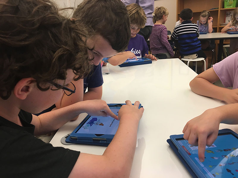
The target market for the app are kids ages 3 to 6 years old, and we were able to have the new design put through its paces at The Lovett School with children in grades kindergarten through fourth grade. The team observed nearly 100 kids over the course of four 30-minute sessions.
From contextual analysis observing the pain points and successes of the kids as well as feedback during the Q&A sessions provided valuable feedback for immediate improvements and long-term changes.
prototypes & testing
User testing
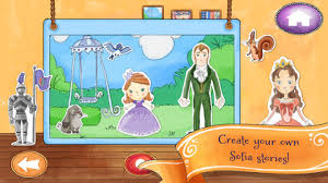
Sofia the First: Story Theater
Toontastic
After completing our analysis, each member of the team sketched ideas that took into account solutions to the character selection screen. A few of the most efficient ideas did away with the popup modal screen but required a total redesign of the app, which went beyond the scope and timeframe that our developer had set for creating a prototype for testing.
We decided to go with a solution that would get us halfway to the final recommendation and kept the popup modal screen. In this new modal, the screen is split between book titles and the assets associated with the selected books. The assets can be sorted by type (character, background and other), and similar items are grouped together.
A test of this design showed a drastic improvement to the workflow requiring only eight taps to create the same five-asset scene that took 19 taps in the previous version. The developer was eager to build this solution and put it in front of users within a couple of days.
One key room for improvement we got from observing the kids was how easy it was to hit the ‘Cancel’ button when they meant to select ‘Add Items’. Some kids had gone through the painstaking process of selecting dozens of assets only to have them all deselected when they accidently pressed ‘Cancel’.
A lot of feedback during the Q&A sessions had to do with the having more assets (ie. cars, princesses). This feedback confirmed the business model for the app to have additional books and art packs that could be purchased. Initially, the additional books where buried on another page, and I proposed a way to increase in-app purchases by showing the unpurchased books and art packs at the bottom of the active assets screen where the kids are creating their scenes.
We took the feedback and created more variations of the modal popup screen to address those needs.
Iterations